Stop losing visitors! A guide to pop-ups and onsite messages for better engagement
 Aleksandra Kozioł
-ws8vwo2wbm.webp) © by Marisa9 from Getty Images Signature via Canva Pro
© by Marisa9 from Getty Images Signature via Canva ProYou have 15 seconds to convince a visitor to stay on your page. Yes, you’ve read that right. Visitors make a decision about staying on your website in 15 seconds. If you’re still here, and 15 seconds have passed, let’s look at some ways to keep your users entertained, interested and happy.
Intro: why do your visitors leave so fast?
So you have a website. You’ve made it SEO-friendly and you’re doing your best to keep AI algorithms happy so LLMs will consider you an expert. But people - actual people, not bots - enter your site and leave just seconds after. Why?
Well, it’s hard to believe, but people are not bots. They have their expectations, and they value their time and comfort. And they’re repelled by:
Slow load times,
Too many pop-ups (ads, cookie compliance pop-up, newsletter invites, promos… everything that hinders them from getting right down to browsing),
Website isn’t mobile-friendly (yes, that can still happen in 2025),
Unattractive layout and outdated graphics,
Difficulty navigating the website,
Last but not least: autoplaying audio or video (you monsters!).
As an internet user, you can probably name at least a few more reasons to quit as soon as you enter. Go ahead, take your time, and think about some of the sites you visited in the last couple of days. Even while preparing this section of the article, I’ve found myself bouncing from some sites with content about keeping users engaged.
Gee, I hope you’re still here.
We won’t help you with getting the most out of your layout and copy, and we’re certainly not here to assess your business model. We’re proud of our website, but we’re no experts on creating an online eye-candy of a site. But we know something about communication with online users and website visitors - and that’s what we’d like to share.
Pop-ups: the who, the why and the how
Let’s start by addressing the elephant in the room. Pop-ups have been with us for as long as websites have. Even with all the powers of ad blockers, they come back. They’re inevitable. But they’re not inevitably bad.
Most websites rely on pop-ups to convey their messages and get the visitors to perform a specific action. Don’t just take it from us. Here’s the official White House home page with a pop-up advertising a newsletter.
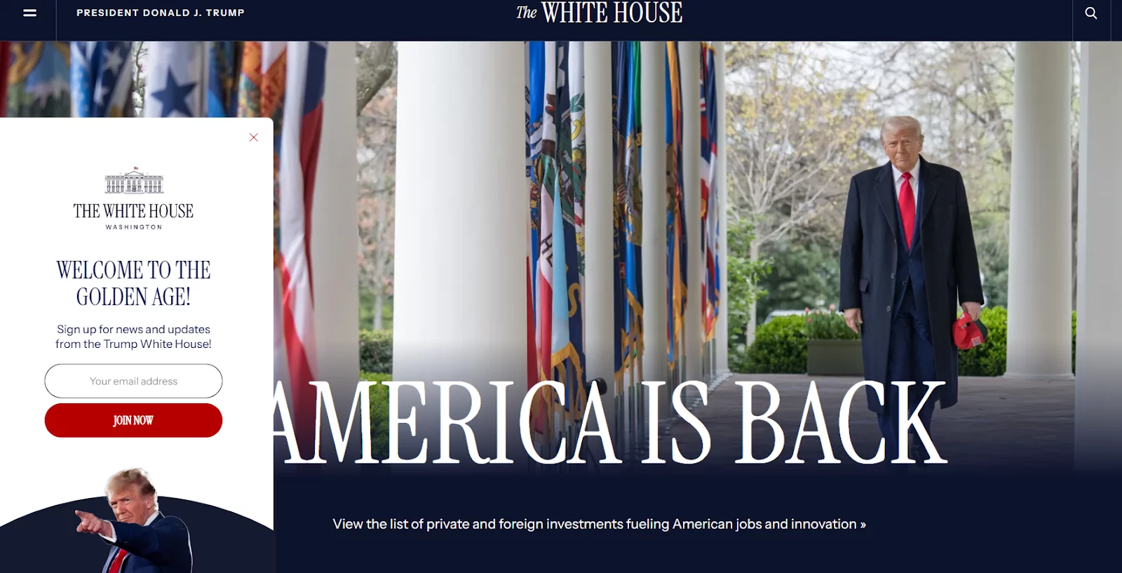
Source: whitehouse.gov
If the centre of the government of the most powerful country on the planet uses pop-ups - why shouldn’t you?
Of course, chances are you’re not running a government of a nation of 340 million people. So why would you need a pop-up on your website?
Lead generation: The most common use. "Give us your email, we'll give you something cool." (e.g., 10% off, an ebook, a checklist, or, in the White House’s example, a front-row seat to running the nation).
Sales and promotions: Announce a flash sale, a special offer, or free shipping.
Creating urgency: Time-sensitive offers ending too soon, seasonal sales, or even breaking news on news sites – they can all benefit from a pop-up to make them more visible.
Preventing early exits: exit intent triggers help you keep visitors on the website with a last chance offers just for them as they’re leaving.
And how can you make your pop-up strategy hit the sweet spot of the highest engagement with the least amount of visitor irritation?
1. Pop-up targeting and triggers
Don't show the same message to everyone. The magic is in showing the right message to the right person at the right time.
Triggers (The "When"):
On exit-intent: The most popular and effective trigger. The tool detects when a user's mouse is about to leave the browser window and shows the pop-up. It's your last chance to grab their attention.
On entry: if you don’t want to waste time, you can choose to display the pop-up as soon as possible.
Scroll depth: Show a message after a user scrolls 70% down a blog post. They are clearly interested in the content.
Targeting (The "Who" and "Where"):
Web push subscribers: if you’re using pop-ups to advertise web push, you can exclude those already subscribed.
New vs. returning visitor: Welcome new visitors with a 10% discount - a pop-up that’s shown only once. Or welcome a returning visitor. It’s up to you.
Device: Show a different, simpler pop-up on mobile vs. desktop.
2. Provide genuine value in your pop-up
Your offer (the "lead magnet") has to be compelling.
Bad: "Sign up for our newsletter." (And… what do I get in return?)
Good: "Get a 15% discount on your first order." (Direct value).
3. Design and copy
Headline: Make it punchy and benefit-driven. "Stop Paying For Shipping" is better than "Free Shipping Offer."
Body copy: Keep it short. Use bullet points if you need to.
Call-to-Action (CTA): The button. Make it a clear command.
Visuals: Match your brand's colors and fonts. A jarring, ugly pop-up erodes trust.
The "X" button: Make it painfully obvious and easy to click. Hiding the close button is a dark pattern that users hate.
4. Don't be annoying
Frequency: Control how often a user sees a pop-up. Don't show the same email sign-up form to someone who has already subscribed or closed it 5 times.
Choose what’s important: Here’s the thought – if you have a new fantastic offer to promote via a pop-up, maybe turn off some other pop-up for the time being? Using a one-in-one-out method can help you declutter the page.
Timing: Don't throw a pop-up in someone's face the second they land on your site. Let them breathe. Give them at least 5-10 seconds.
Mobile experience: A full-screen pop-up on desktop might be okay, but on mobile, it's a nightmare. Google can penalize sites for intrusive mobile interstitials.
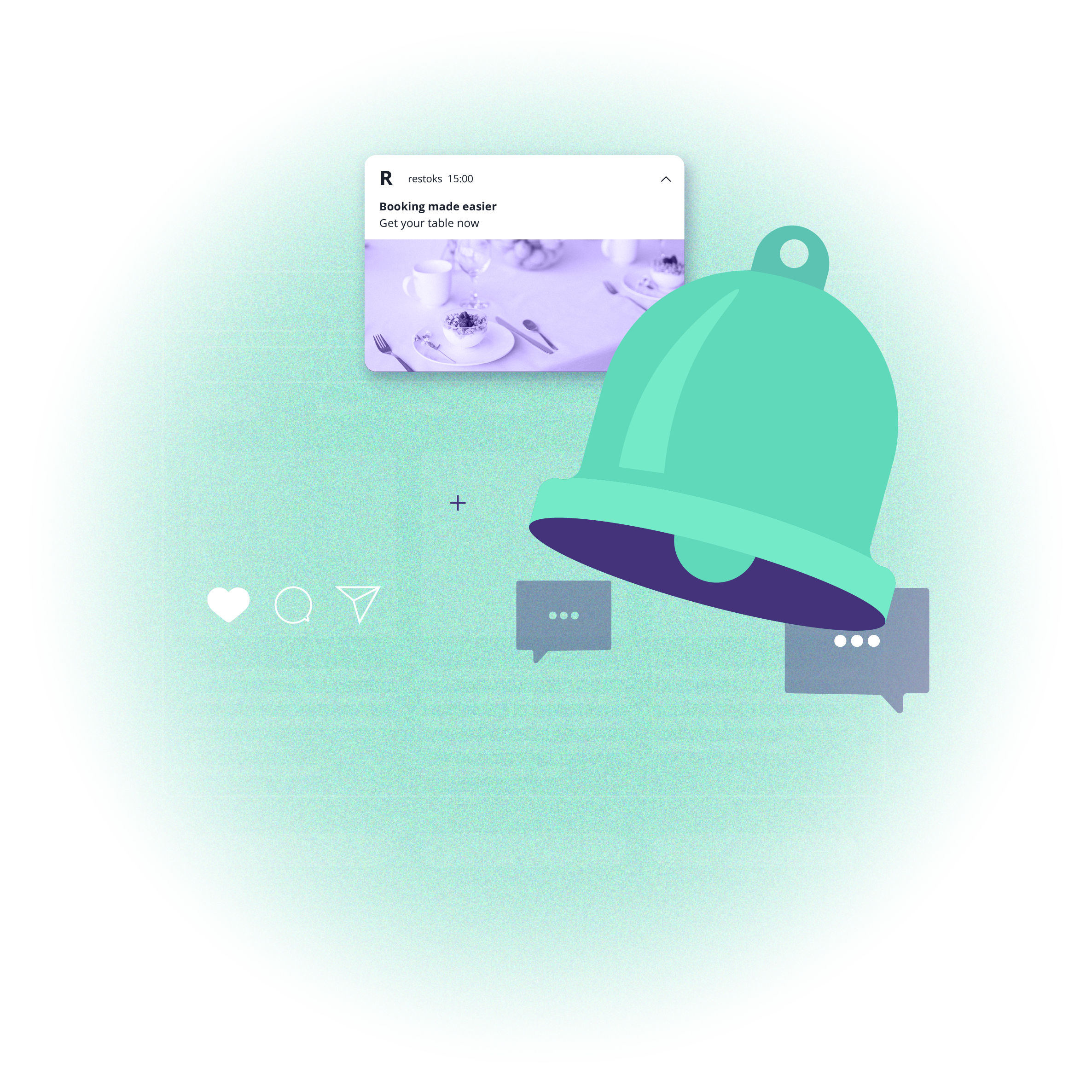
Onsite notifications: informative, helpful and user-friendly
Pop-ups aren’t your only way of engaging visitors on the site. Let’s take a closer look at onsite notifications: the web push younger sibling. It has the structure you’ve come to expect from web push: a short title and body text, an optional big image and action buttons. The difference? It’s displayed on the site and no opt-in is required.
Since they’re less intrusive and more sleek than a pop-up, onsite notifications are best employed to inform rather than advertise. Pop-ups are here to rile you up – and onsite notifications gently guide you through the offer, showing more interesting upsell options and cross-sell products.
And yes, you can build targeting to onsite notifications in the most effective way.
Traffic source or current URL
Number of pages visited
Session duration or time spent on a page
Device type or language
Web push subscription status
Capping and priority options
Geolocation targeting
Faster targeting with segments
The strategy for non-intrusive messages is similar to pop-ups but with a greater emphasis on subtlety.
Concise copy is crucial: You have very little space. The message must be incredibly clear and to the point. Get to the value proposition immediately.
The CTA matters: Even though it's subtle, the goal is still to get a click. Use a clear, action-oriented button with a contrasting color.
Targeting is everything: An onsite is most effective when its message is directly related to the content the user is currently viewing. A generic message on every page is just a less-annoying pop-up.
Let the user be in control: Always include an obvious and easy way to close the notification. Don't make them hunt for the 'x'.
Location, location, location: Pick the best place to display the onsite notification - a corner of a page or centre. And also decide if you want it seen on all pages or just selected ones. There’s a lot to decide.
Summing up: build the best user experience
Once you have it all sorted out: what to promote, how and to whom – and you set up your targeting and triggers accordingly – just sit back and wait for the data. Yes, the data. In PushPushGo, you can track the onsite and pop-up performance in our comprehensive analytics panels.
Then, you can adjust and learn.
Just remember the basic distinction: a pop-up is a happy, cute and fuzzy golden retriever demanding your attention. An onsite notification is a stoic English butler softly whispering good advice in your ear. You need them both to make your life better.
If you’re ready to expand your multichannel strategies, please get in touch with us. Our team will help you choose the best solutions and start you up with targeting to make your experience better. And if there’s a pop-up with newsletter subscription on the right side of the text, consider signing up. There’s still more wisdom to be shared.
Content Specialist @PushPushGo
Editor and writer. She is interested in media and new technologies.
Try PushPushGo to engage and connect with your audience.
Create an account and start testing!


-kzjq5bkqnz.webp)
