8 tips to increase the number of your web push notification subscribers
 Olha Lypnytska
Web push technology - and the success of your push notification campaigns -is only as powerful as the audience it reaches.
And since acquisition costs for new users continue to rise, it’s essential to make the most of every visitor who lands on your website. Once you’ve invested in attracting traffic - through paid campaigns, SEO, or social media - web push allows you to capture that potential and turn it into long-term engagement.
By encouraging users to subscribe, you can stay connected even after they leave your site.
That’s why growing your database of web push subscribers should be one of your top priorities. The larger (and more engaged) your subscriber base, the greater the impact of every campaign - helping you boost engagement and reach your audience directly, anytime.
What you should know about web push subscription rates
On average, web push notifications generate an opt-in rate of around 1–1.5% of all monthly visits. This is still competitive compared to email, which often requires multiple fields and a higher level of user commitment.
Why? Because users don’t need to share any personal information. A simple click on “Allow” is enough to start receiving notifications - fast, secure, and frictionless on their mobile devices or desktop computers.
If you want to collect subscribers even more effectively and enhance your push notification performance, here are proven strategies to boost your opt-in rate and engage customers more efficiently.
1. Choose the right integration type for your website and PWA
The way you integrate web push notifications into your website directly affects your subscription rate, user experience, and available features.
PushPushGo offers two integration types - each designed for different technical setups and goals, helping you reach users on various platforms, including Android push notifications and iOS users.
Integration with your own domain (recommended)
Integration with your own domain is the fastest way to build your database of active users.
Here are a few reasons why it works better:
Single opt-in. The subscription process is streamlined into a single click.
The language of the sign-up form is adjusted according to the language of the browser or mobile device.
The default browser sign-up form looks more trustworthy for Internet users and gets more clicks than branded ones.
Because it feels secure and native, this method typically delivers more subscribers than a double opt-in form and ensures your push notification marketing reaches a wider, more responsive audience. In the screenshot below, you can see how the number of daily push subscribers increased after switching the subscription from a double-click to a single-click format.

To do this type of integration, your site must have an SSL certificate (HTTPS).
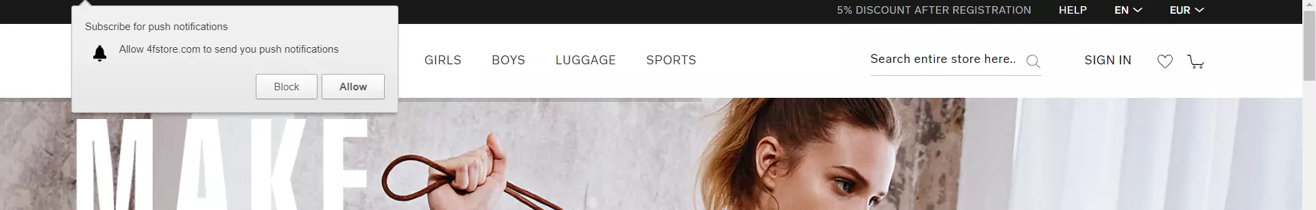
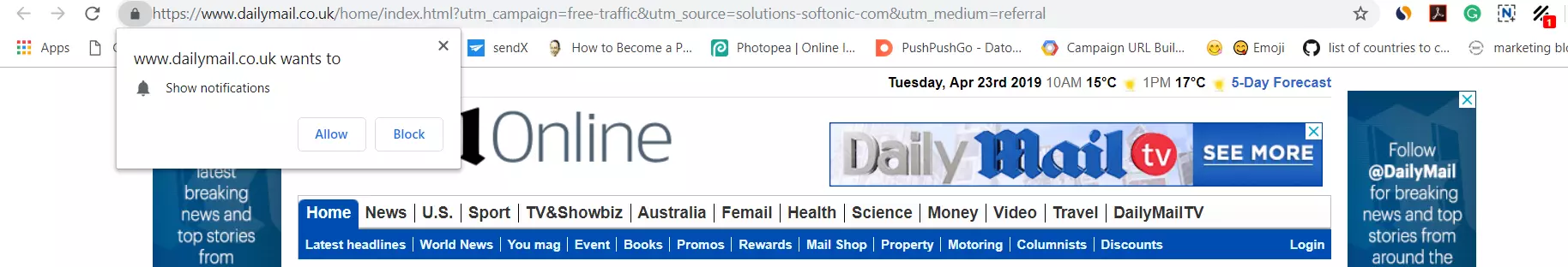
Below are a few examples of how this type of subscription form appears on the website:
4F
Uol.com.br

Dailymail
Collect subscribers and send notifications directly on user's desktop or mobile screens!
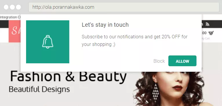
Basic integration
Websites that don’t have HTTPS can still use push notifications by integrating through a PushPushGo subdomain (for example, yourbrand.pushpushgo.com). In this case, users subscribe through a double opt-in process, which usually results in a 20–40% drop off on the second step, but you gain more flexibility to design your own messages, add branding, or test custom incentives.
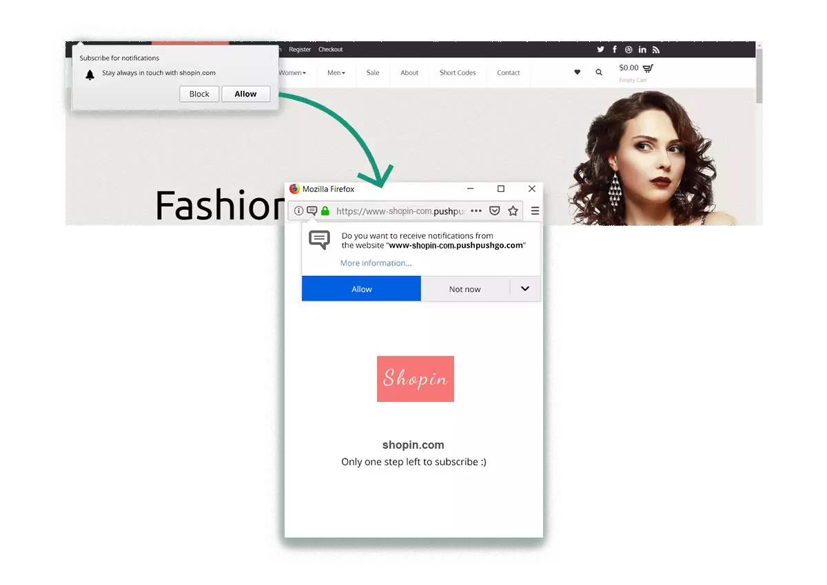
While the single-click subscription form usually generates more sign-ups, the double-click form offers a different kind of advantage: it helps you build a more engaged and intentional subscriber base.
Because users need to confirm their decision twice, it naturally filters out those who might accidentally subscribe. As a result, you collect only the subscribers who are genuinely interested in your products, services, or content, which often translates into higher engagement and conversion rates later on.
But there are additional benefits beyond audience quality:
1. More control over messaging and incentives
Unlike the default browser prompt, the editable subscription form allows you to add custom text, visuals, and value-based messaging. You can, for example, promote “app exclusive promotions” or offer access to exclusive content via web push notifications - turning the opt-in process into a mini-conversion moment.

Branded and customizable design
If you are not using the default signup form, you can align the look and feel of your subscription form with your website - adjusting colors, fonts, and even adding your logo. This visual consistency helps reinforce brand voice and trust, making a strong first impression.

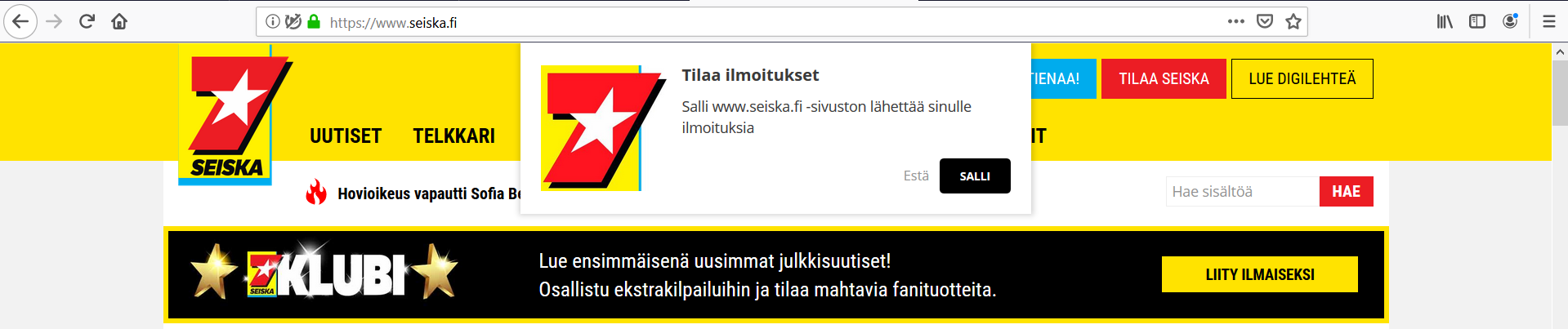
Examples of branded custom web push subscription form:
Etam

Seiska
3. Second-chance subscription opportunities
When a visitor declines your notifications, the double-click setup gives you the flexibility to show the form again after a defined period (for instance, 30 days later). This allows you to re-engage inactive users at a more suitable time - perhaps when they’re more familiar with your content or ready to take action.
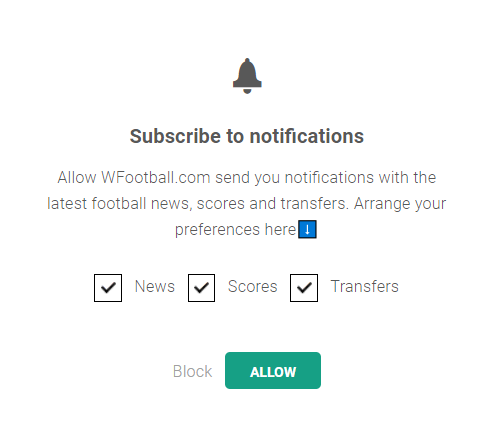
4. Personalized subscription preferences
You can let users decide what type of updates they want to receive. A subscription form that captures user preferences not only improves user satisfaction but also ensures your notifications remain relevant, which reduces opt-outs and improves retention rates.
Would you like to learn more about the key differences between web push and mobile push notifications? Check out our explainer article.
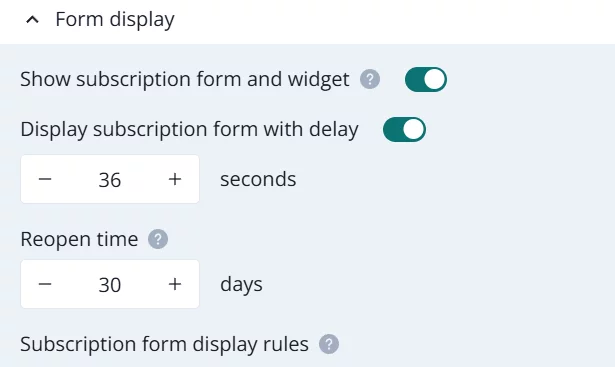
2. Perfect timing: when to display your web push subscription form
Timing can make or break your subscription rate and overall push strategy. Even the best-designed prompt won’t perform well if it appears at the wrong moment.
Browsers like Google Chrome recommend avoiding permission prompts that appear immediately after a page loads. Users who haven’t yet interacted with your content are more likely to block notifications altogether.
Also, make sure your prompt doesn’t compete with other pop-ups or banners. Too many overlapping elements can distract or frustrate users, lowering your opt-in rate.
If you prefer a slight delay, set the subscription form to appear a few seconds after the page loads. However, avoid waiting too long - each page refresh restarts the timer, and a long delay might mean mobile users or desktop visitors never see the prompt at all.
3. Perfect placement: where to position your web push sign-up box
Visibility drives subscriptions. The more pages display the sign-up form, the greater your chance of reaching potential subscribers.
As for the best spot on the screen, there’s no one-size-fits-all rule. Many websites place the prompt in the top-left corner, but this may vary depending on your site layout and user behavior.
To make a data-driven decision, use heatmaps or movement-tracking tools such as Hotjar or Microsoft Clarity to identify “hot zones” - areas where users’ attention naturally focuses. These insights can help you find the most effective placement for your sign-up form.
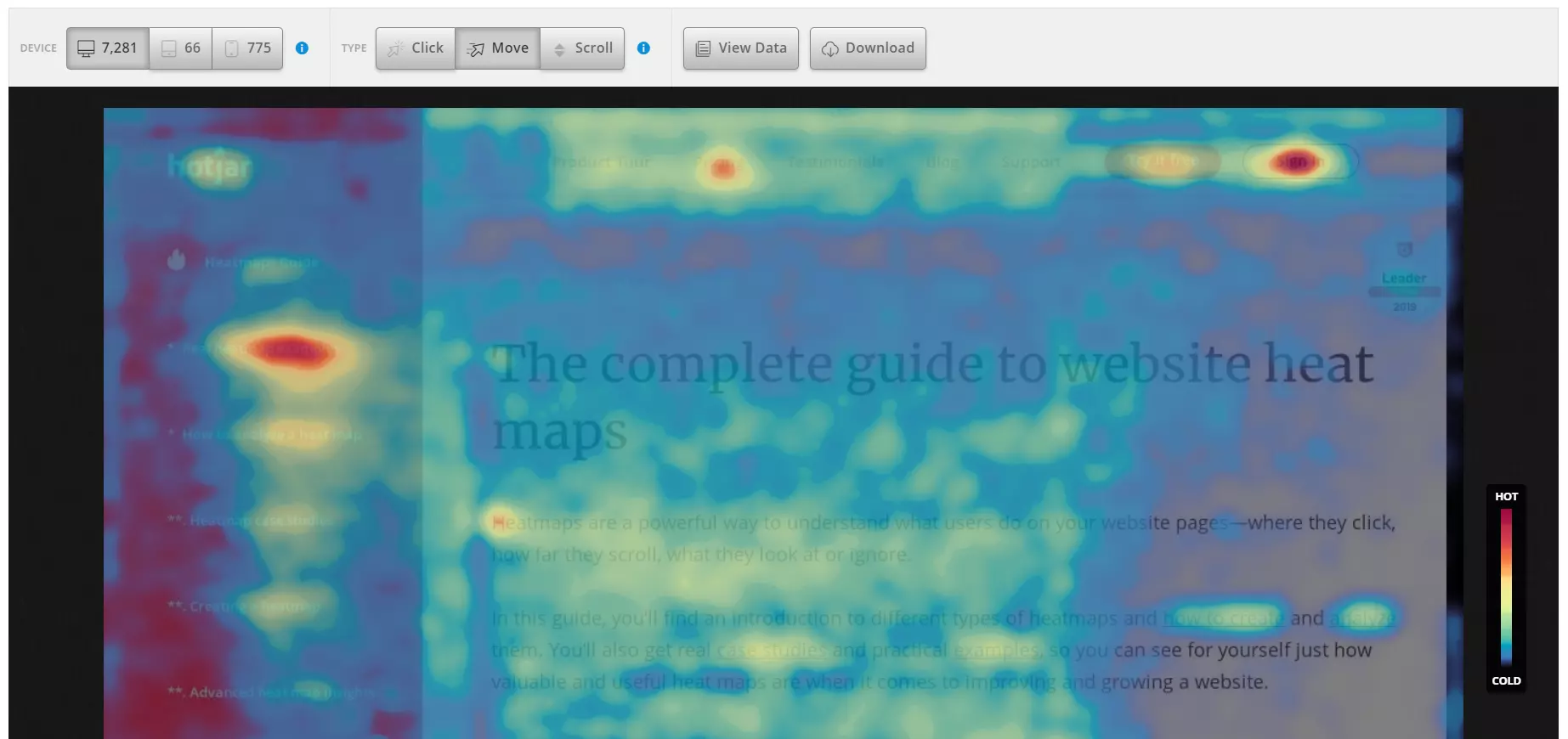
Alternatively, experiment with different positions (top, center, corners) and measure performance over time. Testing is the best way to learn what truly works for your target audience.
This optimization mindset also applies to your push notification campaigns - constant testing leads to more effective push notifications and higher engagement over time.
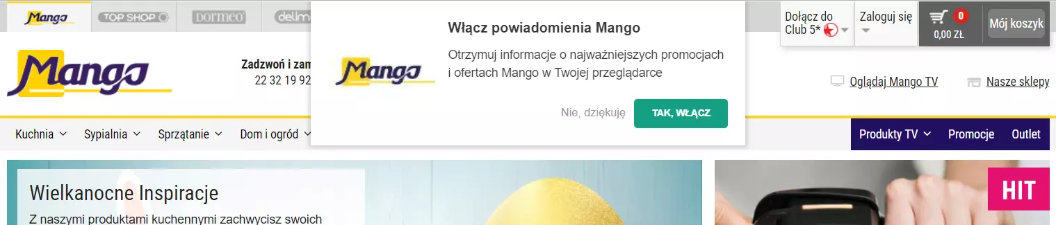
Top
Mango
Relevance.com
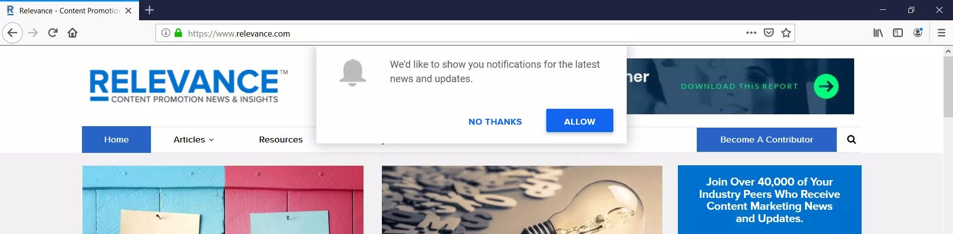
Center
Business Insider
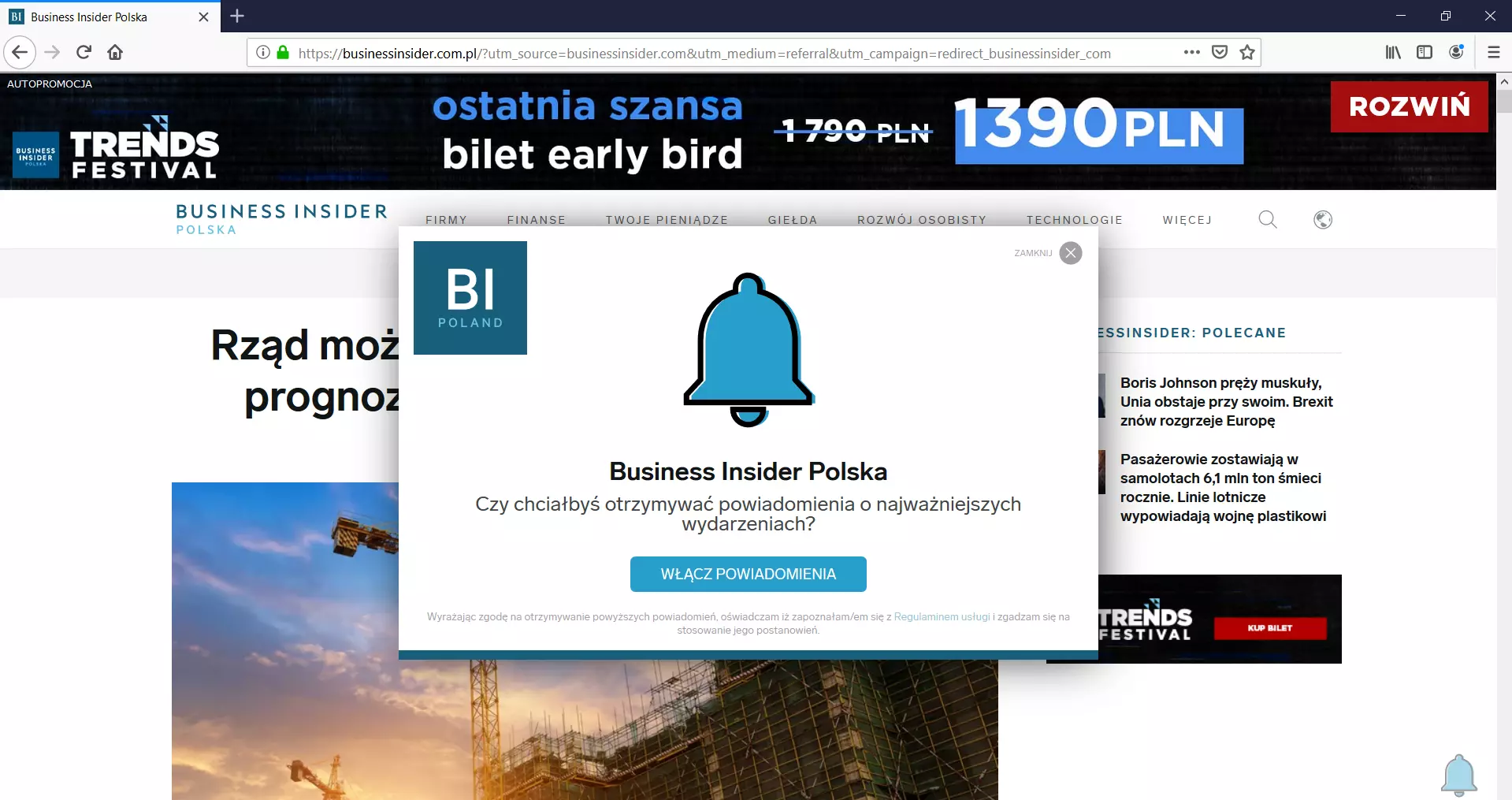
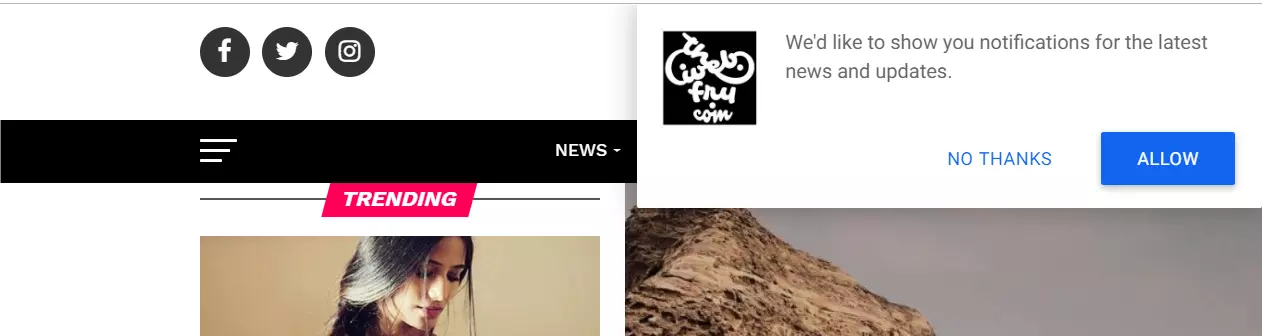
Right corner
thewebfry.com
Left corner
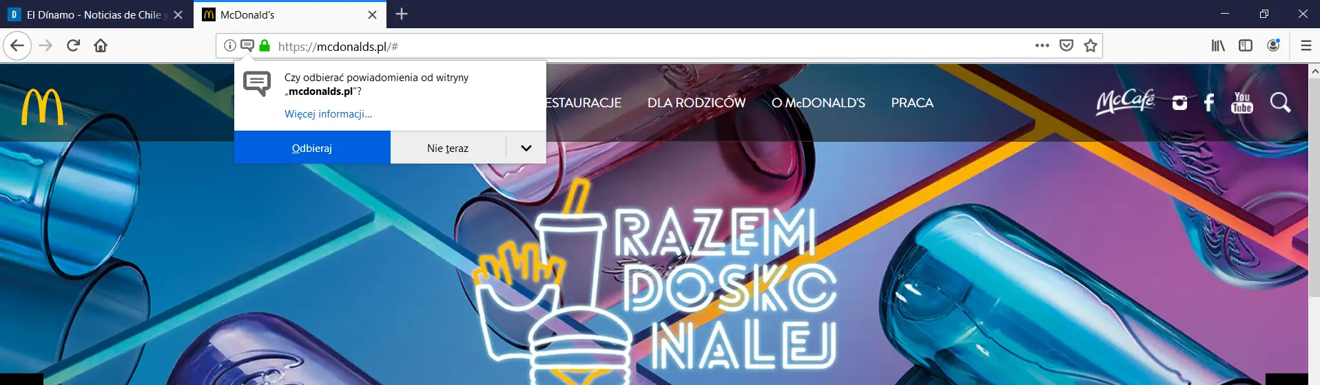
McDonald’s
Lamoda.pl

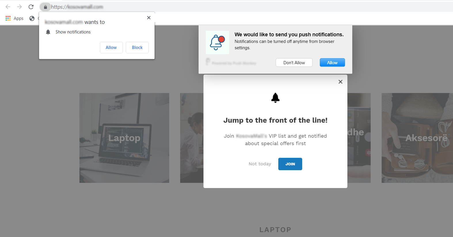
Just remember: balance visibility with user experience. Too many pop-ups or overlapping elements can frustrate visitors and hurt conversions rather than help.
Otherwise, your website will look like this ⬇️
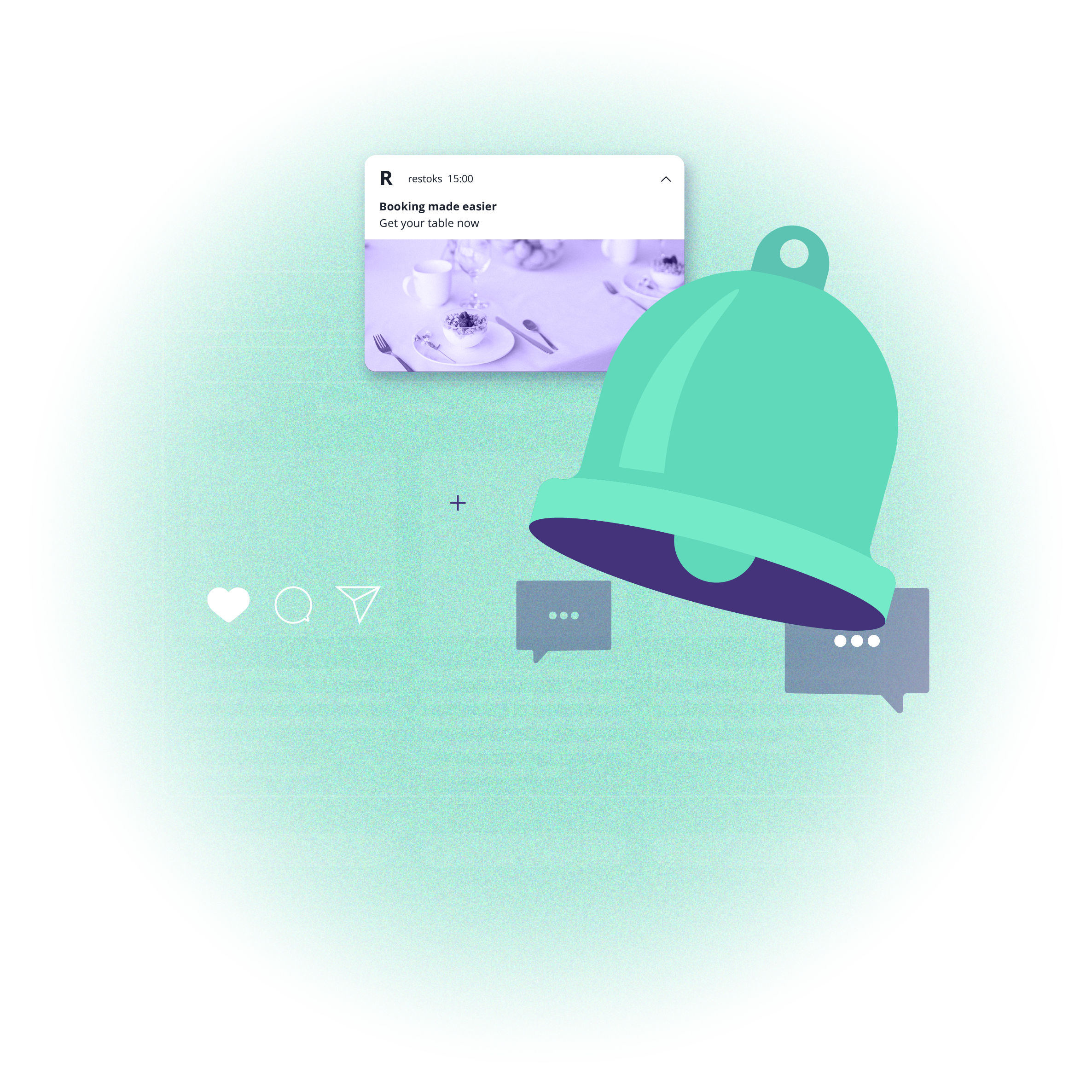
4. Use notification widgets
Not every visitor will subscribe right away - and that’s okay. You can still win them over later using a notification widget.
A widget is a small, clickable icon (often displayed in the bottom corner of the website) that allows users to subscribe, manage their preferences, or revisit past notifications whenever they’re ready.
Without such a widget, users who decline notifications would have to manually change browser settings to re-subscribe - something few people actually do. That’s why adding a widget is a simple yet powerful way to capture lost opportunities. It also allows you to boost engagement by giving visitors more control over when and how they subscribe or receive push alerts.
With this widget, website visitors can also manage their subscription preferences and check sent notifications from a given website.
You can also customize the widget’s appearance to match your site’s design. While a bell icon is the most common, you can replace it with your logo or any other visual that fits your brand voice.
5. Simplify the subscription process with a toggle switch
Instead of relying solely on permission prompts, you can give users more flexibility by adding a toggle switch to your website.
This small, visible button allows visitors to subscribe to push alerts at their own pace, without interrupting their browsing experience. It’s a simple, user-friendly alternative that blends into the site’s design and makes opting in feel natural rather than forced.
With the toggle switch, you can:
Keep the subscription option accessible at all times, increasing your chances of conversions later in the session.
Reach visitors who ignored or closed the initial pop-up.
Capture more intentional, engaged users who subscribe when they’re genuinely interested in your content.
Support your push notification marketing strategy by steadily growing your subscriber base over time.
Once users opt in, you can follow up with personalized messaging and automated push notification campaigns designed to boost engagement and retention.
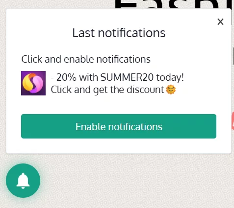
6. Use pop-ups to recover blocked subscriptions
When browsers or devices block native permission prompts like Chrome’s Quieter UI or iOS’s Home Screen requirement, pop-ups can help you reach those users again.
Display a clear, value-oriented pop-up that explains how to enable notifications or why it’s worth subscribing. Use it to guide iOS users through the sign-up process or remind Chrome visitors who missed the native prompt.
-pp5zpsunii.webp)
Smart pop-ups can turn blocked or missed opportunities into new subscribers and improve your push notification open rates.
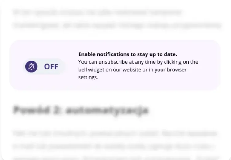
7. Keep it transparent to build customer relationships
Trust is the foundation of every successful subscriber relationship. Many users hesitate to allow notifications simply because they don’t know what to expect.
Help them make an informed decision by clearly explaining:
Why subscribing is beneficial (e.g., instant updates, exclusive offers, flash sales)
How notifications appear on different devices and platforms
What kind of data is collected (if any)
How they can unsubscribe anytime
Transparent communication not only builds trust but also makes your push notification marketing strategy more credible and user-friendly.
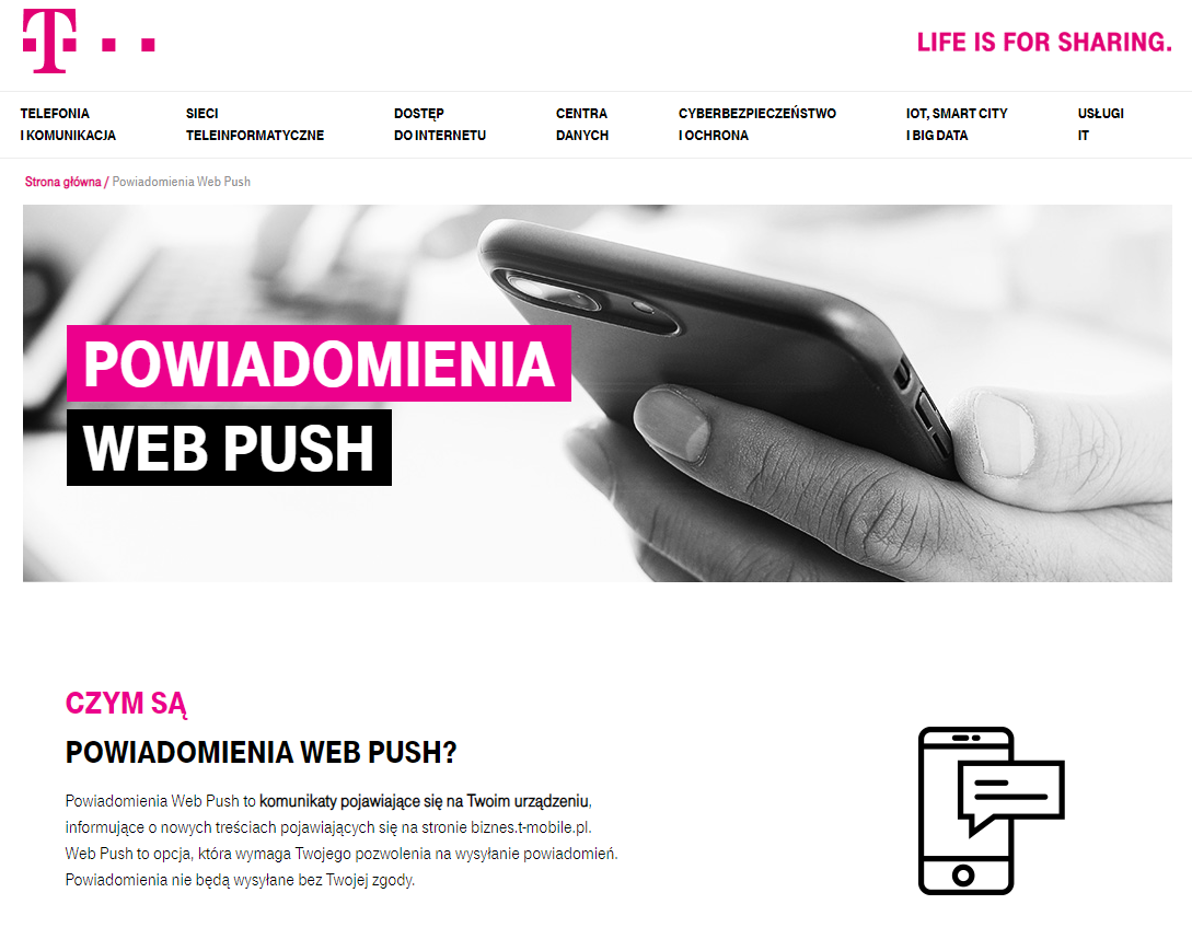
An excellent example comes from T-Mobile, one of the biggest telecom providers in Poland, which published a dedicated page explaining how web push notifications work. By being transparent, they helped users understand the value and make a conscious choice.
8. Test, analyze, improve your push notification strategy
As Jeff Bezos famously said, “Our success at Amazon is a function of how many experiments we do per year, per month, per week, per day.”
The same principle applies to building your web push subscriber base. Continuous testing and optimization are key.
Experiment with:
The design and copy of your subscription form
The timing and placement of prompts
Incentives and calls to action
Then analyze your data to identify what drives the highest conversion rates and best click-through rates. Every target audience behaves differently - the only way to know what works for yours is to test and learn.
And most importantly, give users a reason to subscribe. Offer value right from the start - whether it’s breaking news, exclusive discounts, app exclusive promotions, or early access to new content. Demonstrating tangible benefits immediately boosts your chances of success.
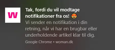
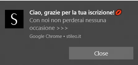
Bonus tip: make a great first impression with a welcome push notification
Once a user subscribes, don’t leave them hanging. Send a welcome push notification to thank them and show what kind of updates they can expect.
A simple “thank you” message not only reinforces a positive user experience but also sets the tone for future communication - turning a one-time visitor into an engaged, loyal subscriber and improving customer retention.
Send web push notifications! Start testing now!
You don't need to send every web push message personally after somebody subscribes to notifications.
Fortunately for you, it is possible to automate this action. “Welcoming message” is one of the easiest web push automation scenarios to implement. It will let you be able to greet every newcomer right after he or she signs up for your notifications.
Fortunately for you, it is possible to automate this action. “Welcoming message” is one of the easiest web push automation scenarios to implement. It will let you be able to greet every newcomer right after he or she signs up for your notifications.


Eager to learn more about web push? Download our free e-book
Growth Marketing Manager @PushPushGo
Passionate about advertising, digital technologies and marketing itself. Life motto: "Growth starts out of the comfort zone".
Try PushPushGo to engage and connect with your audience.
Create an account and start testing!


-vtli8sa2ks.webp)
